Amanda Schmutzler
Racecar Build
A construction management platform connecting crews, customers, and stakeholders through every stage of a build.
- Problem: field crews, office staff, customers, and stakeholders had no shared system — tracking was manual and disconnected.
- Approach: five role-specific apps (a web app plus four native apps) under one shared style guide and persona-driven hierarchy.
- Process: interviewed every role, mapped the flows, then designed and prototyped all five platforms in parallel, alongside one other designer.
- Impact: replaced manual tracking with one connected source of truth across the whole build lifecycle.
 Introduction
Racecar Build is a construction management platform for the residential new-construction marketplace — a web app plus four native apps for crews, customers, and stakeholders, unified by one style guide.
 My Role
I worked on this as an independent product designer, alongside one other designer: interviewing every role to find where a single system could replace manual tracking, helping set the direction for one shared style guide and persona-driven hierarchy, and designing all five platforms in parallel so they'd ship as one coherent system rather than five separate efforts. What shipped was a connected source of truth spanning field crews, office staff, customers, and stakeholders.
The problem, and the approach
What kept crews, office, and customers disconnected, and the system built to fix it.
 Problems
- No shared system connecting field crews, office staff, customers, and stakeholders
- Warranty and documentation tracked manually, prone to loss or delay
- Customers had little visibility into their build's progress or timeline
- Each role needed a different view into the same underlying build data
 Solutions
- Role-specific apps: a web app for admins, native field apps for crews, and dedicated customer and stakeholder apps.
- Shared scheduling: one calendar keeping every phase of a build visible to everyone involved.
- Centralized documentation: uploads, warranties, and build details tied directly to each project.
- Unified style guide: one design system across every platform and role.
 Platform overview
The home dashboard, shared calendar, and customer family view give every role (crew, office, and customer) a consistent way into the same build data.


Home dashboard, shared calendar, and the customer-facing family view.
 Documentation & warranty tracking
Every build's documents and warranty information live in one place — searchable, uploadable, and visible to the right roles at the right time.
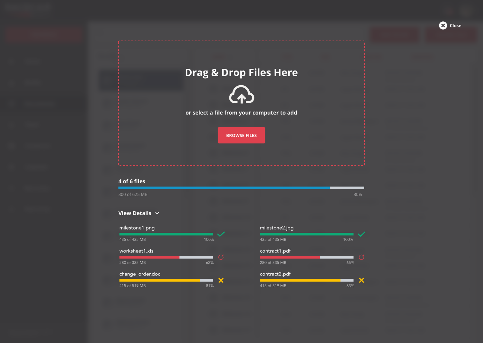
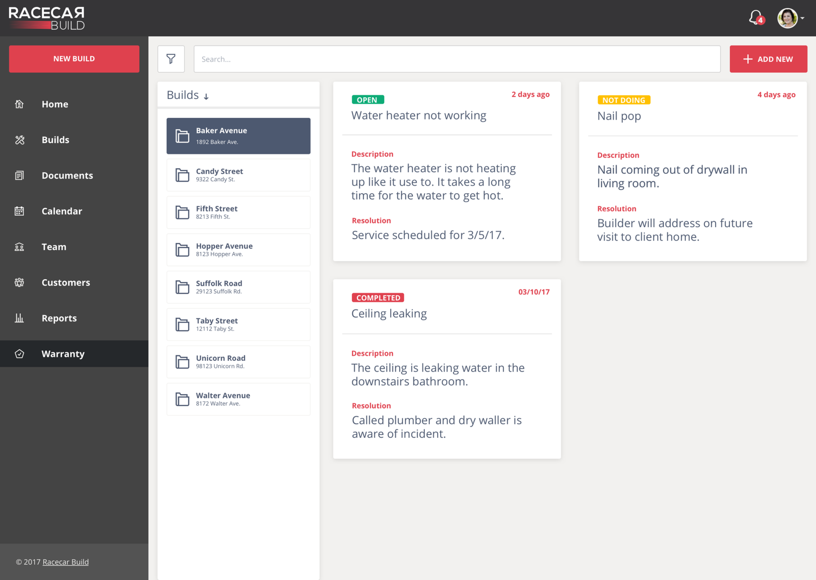
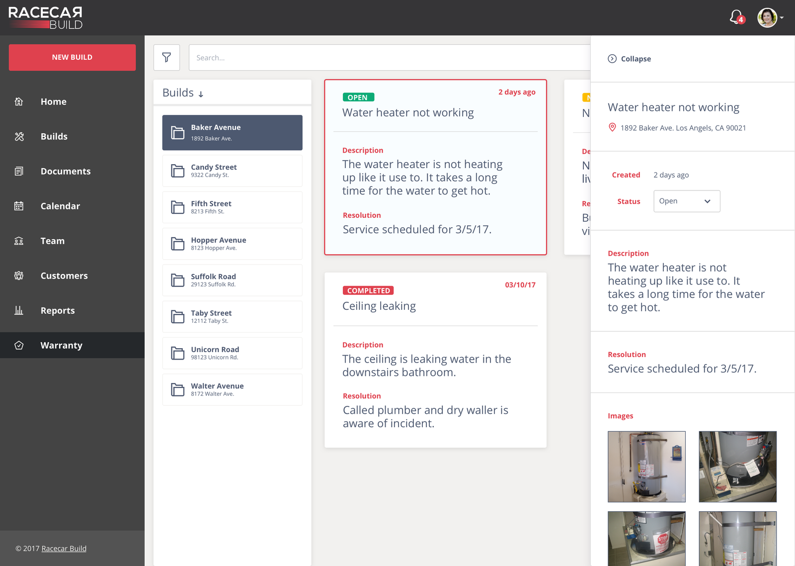
Document upload, warranty overview, and warranty detail views.
 Team visibility & platform reach
Who's on a build, and the five connected apps that keep crew, office, customers, and stakeholders working from the same source of truth.
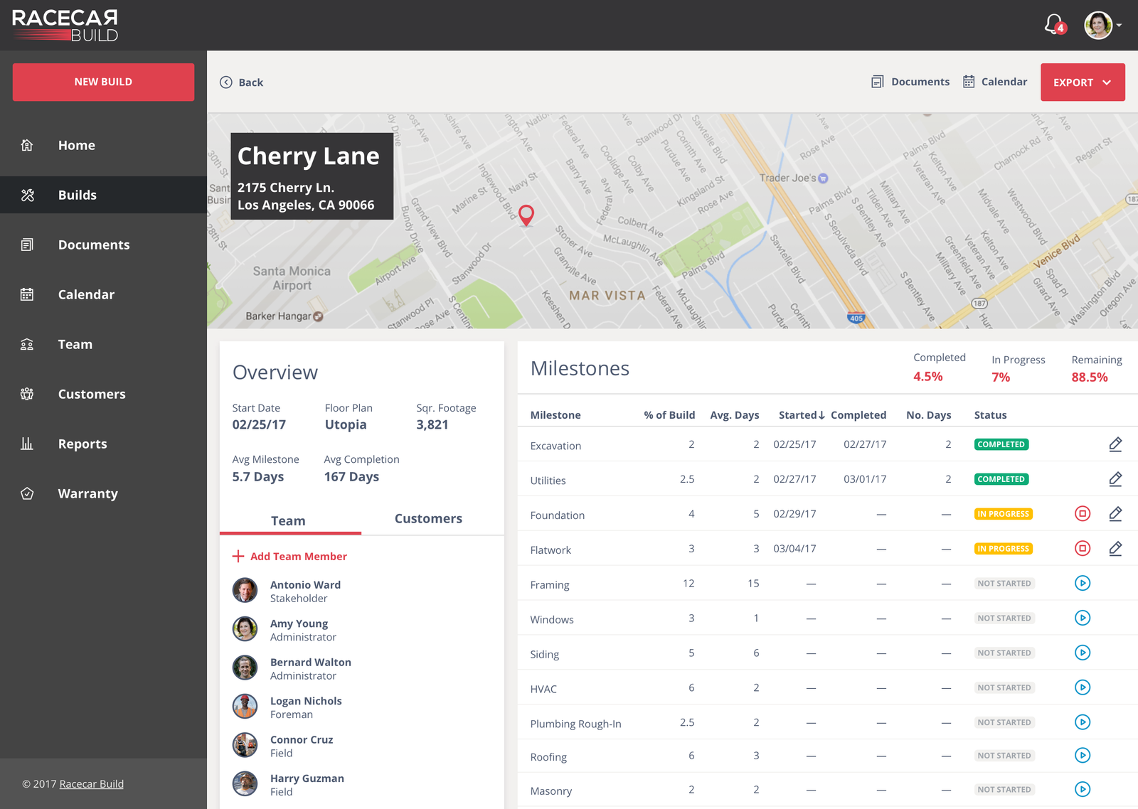
Team & build details
A dedicated team view shows everyone assigned to a build and their role on it at a glance, so handoffs between crew, office, and stakeholders stay clear.
Value added & prototypes
Racecar Build gave a residential construction company one connected system for field crews, office staff, customers, and stakeholders — replacing manual tracking with a single source of truth.

 Flows & Personas
Site maps for the builder, field, customer, and stakeholder experiences, paired with the personas that shaped every role-specific decision.


App architecture and web application flows across builder, field, customer, and stakeholder roles.


User personas for the builder, stakeholder, office, and customer roles.
 A few decisions worth explaining
None of these were arbitrary — each traded simplicity for something that fit how each role actually works.
Why five apps, not one responsive one
The roles don't share a context — a crew member needs a thumb-friendly app on a spotty connection, a stakeholder just checks in for thirty seconds. One interface would have meant designing to the lowest common denominator.
Why customers get their own app, not a login
A customer doesn't want the internal tool, they want proof their build is moving — so I built a separate, read-focused app instead of a limited-permissions login, keeping internal details like costs and scheduling out of view.
Why personas, not permission toggles
A configurable system would have been more flexible on paper. I designed around four named personas instead: Mark, Jordan, Lisa, Tom and Kim. Each app's hierarchy fit what that person actually needed first.
Why one style guide across five different apps
It would have been easy to let each app's visual language drift across platforms and teams. One shared style guide kept them reading as the same product family, even where content and permissions differ completely underneath.
 Style Guide
One unified design system, covering colors, typography, and components, shared across every platform and role.
 Product walkthrough
 Outcomes
Racecar Build went from five disconnected roles tracking things manually to one shared system live across all five apps.
Warranty and documentation that used to live in email threads and spreadsheets moved into a single, searchable system tied directly to each build and visible to the right roles.
The customer-facing family view gave clients direct visibility into their build's progress, cutting down calls to the office just to ask "where are we at." Clients can check progress themselves.
Crews, office staff, customers, and stakeholders can all see where a build stands at every stage, from the shared calendar to the last warranty document, all from one source of truth.
 What I learned
Design for the person, not the permission toggle. I learned that building around named personas kept each app focused on what that person needs first, which turned out simpler than a configurable system trying to serve everyone.
Customers want proof of progress, not a limited version of the internal tool. I learned that a separate, read-focused customer app gave clients what they were really asking for, a clear sense of where the build stood, without exposing costs or scheduling.
Start with where the manual work lives. I learned that interviewing every role first showed where one system could replace email threads and spreadsheets. Warranty and documentation tracking was the clearest place to start.
 Why I gravitate toward this kind of work
Racecar Build is the kind of problem I look for: one system, many very different people, and no room to design for only one of them.
 01 · Many users, one system
I like designing for a builder in the shop, a customer on their phone, and an office manager all at once, and making it feel obvious to each of them.
 02 · The right view for each person
Every role needs its own way into the same information. I like deciding what each person should see first and what can safely stay out of their way.
 03 · Moving parts, made practical
Schedules, warranties, documents, and four kinds of users all had to fit together. I like organizing that much complexity into something practical and clear.
Why bring me onto your team
Racecar Build meant designing one coherent system for four very different users: builders in the shop, customers checking progress from their phone, stakeholders who just want the headline, and office staff running the business day-to-day. All of it runs off a single shared source of truth.
That's the part of UX work I find most energizing: making one system feel obvious to everyone who touches it, no matter how differently they use it. I'd bring that same instinct to a team building for more than one kind of user at once.
"Amanda has a mind that can take a number of moving parts and understand how to organize the digital experience into something practical. Full recommendations to anyone considering working with Amanda."